Tuesday, December 3, 2013

Trade with Democratic Roadkill


Quite a few months ago I received another large package from Duane at  Democratic Roadkill.  This is probably the 2nd or 3rd time that we have traded.   He always sends me a huge collection of cards, most of them Allen and Ginter. This time was no different; as you can see from the above photo he obliterated my want lists for the 2011 A&G set.  Duane usually sends over some cool, random Mets cards from vintage to present, but I'm going to focus on the A&G stuff this time out.

If you didn't already know, Duane is quite the Ginteraholic.  More so than me. I thought I could out Ginter him, but nobody can out Ginter the master.  From what I can tell from his blog he is basically putting together master sets of all the Allen and Ginter offerings and doing a much better job than I.  He's been showing off his rip  card collections as of late. 


Most people are probably sick of 2012 and 2013 A&G, but this is 2011 A&G so maybe you guys will like the rediscovery.


Anyway, here we go:

Some nice base cards to start us off.  Non-sports base cards at that. One is known for jumping around like a crazy person and the other is known for being an Iron Chef.  They both look like they are into the extreme area of their professions: extreme running and jumping and extreme chefing.

Here's a video of  Tim "Livewire" Shieff for you to get an idea of what this guy does.  I watched it with the sound off, so it could have language that is NSFW.  The sound does matter unless you can hear his ankles shattering. At least I'm assuming they're shattering,  my ankles and knees hurt just from watching the video.


A few examples of the short prints that Duane sent over. Vermillion is the only person that I haven't heard of.


I didn't realize that Brett Anderson was an Okie.  Both his and Matt Holliday's dads were both OSU baseball coaches.  This is Bedlam week in Oklahoma; the rivalry game between OU and OSU so these cards fit my mindset this week.  With the way OU is playing on offense (badly!) and they way OSU is playing on defense (pretty good) this could be crappy end to the football season for us Okies, I might have to avoid the internet for a while and seek solace in my trading cards.


The Animals in Peril mini set is nice.  A little depressing I guess, but informational.  Who knows, maybe a baseball card collector can some how turn the tide and help out some of these animals. Maybe influence a young person to go into agriculture?


The sketch cards are always nice. I like them because I have an interest in art and drawing myself.  The Twins card is a little odd in that it is a drawing of a drawing.

The David Wright card commemorates his being the youngest Met to reach 1,000 career hits.  This game was played on 4.27.2010.  According to the internet this was a game with the Dodgers and the Mets actually won the game!  With a 79-83 record maybe that should have been the highlight instead.

The Texas flag on Cliff Lee's jersey looks odd in black and white. The hat logo also looks out of place in B&W.  I guess the artist wanted to bring more focus to the player's faces.  The rest of the drawing isn't completely desaturated; the red piping on the catcher's gear is present.  It just seems like those logos would really make the whole drawing stand out more.

The one thing I like about these Worlds Most Mysterious minis from 2011 is that they continue the design on the back. I don't know much about design terminology, so let me show you what I'm talking about.

The World's most Mysterious Figures have this name plate, right?


....and Topps continued the same style of nameplate on the back of the card and just elongated it to hold the text and they added some curly q's. I think the correct term is strikes or keys, but I usually call them curly q's.  But it's still the same basic shape.


I don't think they usually do that even for A&G.  Since I haven't bought a lot of 2012 or 2013 A&G maybe they do now.  I just found it interesting at the time.  Up to this point I'm pretty sure the inserts all had a different border on the fronts and backs.

Some people might call that laziness; I call it continuity.

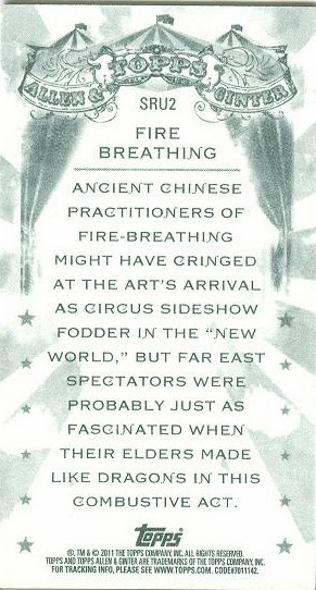
One insert set that I really liked was the Step Right Up set.  From what I can remember reading on the blogs a lot of people really liked this set.  It's colorful and who doesn't like a circus?


The subject matter is cool, but the design of the card fronts is what really drew me in. The background/border is really cool.  The font on the bottom is nice. I'm no font nerd, but it actually reminds me of the Oklahoma font that I've seen online. I'm sure their are many variations of fonts and they all have different names, but that's what I've always heard it called.


 A blogging legend makes an appearance on the Portraits in Penultimate set: Mr. Mike Gellner.


I'm spacing out on what the name of his blog was.  I'm pretty sure it was named after his kid (the little dude in the photo).


Thanks for the cards, Duane.  If you all have a chance go over and check out the dude's want list/trade list and help a guy out!

Thanks for reading!


Thursday, November 28, 2013

The best card I received last year


I’ve been meaning to write this post for, well about a year and a half now.  

I had many different ideas that I wanted to write about, but for some reason I couldn’t get motivated to actually DO it.   It’s funny, when I was I regularly blogging it was pretty easy for me to come up with ideas and get them on (virtual) paper.   I could keep the momentum going and always had ideas to flesh out on the old blog.  Not that many of those ideas were gold, but at least it was something and I could knock out a post somewhat quickly.  In the past year or so I really have gotten out of the habit of blogging and it's been really hard to get back into writing. I still read the blogs though, I just can't get around to writing about cards.  


One of the distractions that we all have to go through are the same personal things going on in anyone's life. Of course my life isn't any different, so I've also go my personal issues to get through as well.  Good things mostly. Not the bad things people usually mean when they bring up “personal issues”; but real life did take precedent on blogging. 


In this particular case I had many ideas on how I wanted to thank Dayf for his sketch card that he sent me.  I was pretty sure that no matter what I came up with, it wouldn't adequately reflect how much I like the cards that he sent over. The sketch of Sam Bradford above is the best of the package.  The other cards in the package were nice, but weren't expected.


 The Dream,  Matisse

One of my early ideas for this post was to compare me and Dayf’s trade as a modern day Matisse and Picasso arrangement. 


I went to the Kimball Museum many years ago to see the exhibit and bought this cool book.  Skimming through the book for photos to scan for this post also contributed to my procrastination.


I don’t quite remember all the details of their friendship. Basically I think they were influenced by one another and at some point they became friends and started a correspondence by mail.  In their correspondence they started to work on a few themes; mentioning to the other via letters what they were working on.  I might be misremembering what went on; it might be a good time to actually re-read the book rather than just look at the pretty pictures.  Many books have been written on the similarities between each artists work even though they belonged to two different schools of art. Picasso being more famous for his Cubist works and Mattisse being part of the Fauvist movement.


Woman with Yellow Hair, Picasso
Probably seems a little arrogant to compare either one of us to two of the masters of the art world, but it's the first thing that came to mind when he sent out his missive to the blogging community to trade pony sketches for Dayf originals.  

Trading sketch cards is a really cool idea and I've only been able to trade with our fellow bloggers a few times so far. It's something I'd like to do more often.

Sketch cards themselves would be the easiest to transport via PWE to one another with blogs and email being way more accessible than the old fashion postal system.  The problem isn’t with technology, it’s with the humans to stop being lazy and being overcome with the ease of looking at stuff online all day and just get to creating and of course writing about it later on the blog.


Anyway, that’s a long winded way of saying sorry to Dayf that it took me this long to thank him for the cool sketch card and also the cards he sent.   It's actually a painted card rather than just a sketch. Makes me feel a little cheap that I only sent him a sketch done with pencil and markers. 

This is the card that he used as inspiration for the art card.

Pretty good likeness.  I don't do helmets very well myself so I know how hard it is to draw them well. The face is really well done too, I like his representation better than the original photograph. 

Since it could be a long while until I blog again I’ll go ahead and show the other cards that Dayf sent over.


This is my first (hopefully not last) Crown Royale card. Pretty nice die cut card of Dorsey Levens. One of my favs on Madden 05 I believe.

I'm not exactly sure why or where Dayf got these uncut University of Oklahoma "cards". I'm glad he procured them and sent them over. They seem to be commemorating the 6 (at that time) national championships that OU has won in football.  


Pretty cool. They come from the Love's stores. I didn't realize they had those in Georgia, but I guess they do.  


Mark Clayton and Mark Bradley were really good standouts at receiver, which is saying something because in the Bob Stoops era we have been pretty deep at the wideout position. It's always nice to get cards of players in their college uniforms.


Thanks again for the cards and Happy Thanksgiving everbody!