
So in the interest of science or fairness or just plain boredom I'm now going to do the second half of the comparison and see how just three random loose packs will compare with one rack pack.
I spent 5 bucks on the rack pack and 6 on the three retail packs. The rack pack was from Target the loose packs were from WalMart. I'm not sure how that will factor in to the fairness of the comparison, but who cares? This is only going to be mildly interesting to the few people who haven't overdosed on the flagship these past few days.
I mixed up all the base cards so that I could keep the mess on my desk somewhat in check so I'm not going to do a base card comparison. This is mainly about the inserts.
First off the inserts I pulled were almost identical to the rack pack:
 One diamond parallel.
 One Topps 60 card. Another Yankee.
 Two of these Topps 60 years of Topps Cards. As a comparison the rack pack yielded one 60 Years of Topps card and a 60 Years of Topps Lost card.
These 60 year inserts are confusing me.

I didn't pull a Diamond Duo, (Thank Goodness!!!) but I did pull another Kimball mini. Love the minis!!!
I also didn't pull a Diamond Giveaway code card, but I did pull something that I think is nicer:

A Mel Ott reprint.

A 1933 Goudey card.
Pretty cool. In case you were thinking that I would leave the post focusing on inserts only I had to add a few base cards in the post.
First up is one of only a hand full of cards that I've ever pulled in my collecting that were damaged.

I thought it was some weird parallel at first, but the foil Topps logo and a "national league leader" type name plate was printed vertically across the card. It's sort of hard to see, but in the lower left corner you can make out a little "T" in the name arch. In the right corner where the team logo is you can see the national league letters over the logo. Kind of interesting.
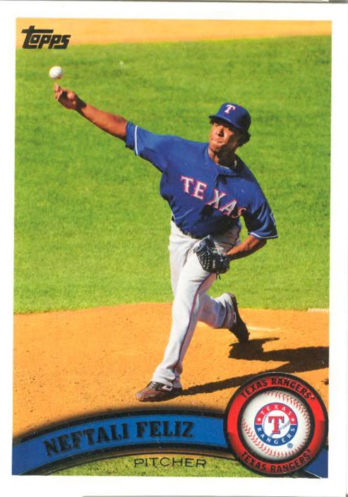
It's kind of amazing that in these pitcher shots the pitcher looks like he's throwing the ball directly up in the air. I can't imagine that pitcher reaching the plate.

Awesome card shot. I count at least 5 ankles on this card. Ankiel=ankle. I know, it's lame. Everytime I see an Ankiel card I think of ankles.

Really nice shot of Ichiro. I love this guy's cards. This looks like the ball is just leaving the bat.

Something I didn't notice before was this little item on the right border on the back.
It's a little random fact about the cards themselves rather than a stat line or a 6 degrees of Mantleness.
In case it's too illegible it says,"in the 1980 Topps set, card number 200 was Willie Mays.
I hope everybody's isn't sick to death of seeing more Topps flagship. I don't think that my experiment really proved much. I was surprised that my three packs yielded that many inserts. I guess part of that is that their are so many of them this year. I still haven't pulled any of those History of Topps cards, and I'm glad I didn't. They look like the worst designed cards in a looong time. Hopefully I won't pull any of those or at least maybe I can find somebody going for that set so I can trade them away.
I'm not sure if my experiences are a good indication of what to expect from retail. I guess just looking at the odds on the back of the wrappers would be better. But that's no fun. I'm going to keep on doing my lame-o experimenting as I collect this set.


No comments:
Post a Comment