Thursday, April 29, 2010

What is your favorite card set?


When I think of baseball cards the first thing that comes to mind is the colorful banners and round borders of the 1980 Topps baseball set. For me it's the quintessential baseball set. I wasn't up on baseball much in 1980. I would rather be outside playing baseball or soccer or playing army or Star Wars rather than watching games or keeping up with certain players.

But when I was watching Magnum P.I. with my mom and felt like going through my cards I always held the 1980 Topps cards in much higher esteem than the 84 and 85 Donruss or the Fleer cards. That doesn't mean that I didn't hold them together with a rubber band or stuff them in a shoe box, because I did. This was before the days of highly profitable error cards or penny sleeves or plastic toploaders. Maybe their was this technology available, but not in a small town in south east Oklahoma. And to my recollection it was a couple of years later that everybody was trying to keep their comics and baseball cards hermetically sealed so they would be worth something someday.

Since I got back into collecting I have thought to try and finish this set. I could only rescue about 5 badly dinged up cards from that set.


You can see how the years of being lost in the attic with a rubber band wrapped around them has taken a toll on the cards.

A good example of this is the Roy Thomas card.


I tried positioning the card in such a way that you could tell how disfigured it is.

Besides the few cards that I've seen online and the 5 that I have in the shoe box, I really haven't searched out many examples to see what they look like. I wanted to surprise myself when I finally got around to trying to collect the set. I wanted each card to be new to me even if I had already seen it before.

So that brings me back to the present.

I'm pretty excited to have "won" an auction on ebay for about half the 1980 set. Part of me feels like it's cheating the other part of me thinks that this is an easy and somewhat affordable way to get started on the set. It's definitely not a complete set so I still have a way to go to finish it and some of the cards are well worn which is fine by me. I'm just interested in seeing all the cool cards from this year finally.


I don't remember there being many action shots and so far I'm right. Out of the 300 or so cards that I've gone through only a handful are "cool" action shots.


My guesses are usually wrong, but I believe that is Joel Youngblood sliding into Foli on this card. Foli has a great "OH CRAP!" expression on his face.


This what I mean by cool action shots.


This is a somewhat pedestrian action shot. Their are loads of these in this set so far. Or at least from what I've seen. Still a cool shot: it's definitely from a game and you can see emotion and the ball is in the frame.

Most of the cards seem to be of the posed shot or candid shot variety. Like this one of Tony Scott.

This is one of the few underexposed cards that I've seen so far in the set. Besides that it's pretty indicative of the type of candid head shot found in these cards.


Here's one of the more goofy candid shots in the set:

"Hey look who's down there takin' my picture. Hello photo boy!"


I'm guessing every baseball set pretty much recaps the previous year in some form. Here we have a Manny Mota highlight.


I'll be lazy and let the card back do the talking.


It's got the ripped out of a newspaper and fake headline theme on the back.


On the other end of the spectrum would be the Future Stars cards:

I'm not sure if Tim's hat is airbrushed. It looks a little weird. He played for the Padres his entire career with a few years of minor league ball so I don't know why it would be airbrushed. I'm also not sure why they felt the need to airbrush his face. It's a little disconcerting that his head looks so cartoonish.


A Victory Leader stat card.
This card features two brothers that led the N.L. with 21 wins apiece. Flanagan led the A.L. with 23 wins. Runner up was Tommy John with 21 wins.


This is atypical of the team checklist cards. Most of them are outside shots with the entire team and managers sitting in rows like we all expect. Going through my stack of cards I came across this floating head Cubs team card. It's weird enough for me to want to show it off. I've seen floating head manager cards, but not floating head team cards.


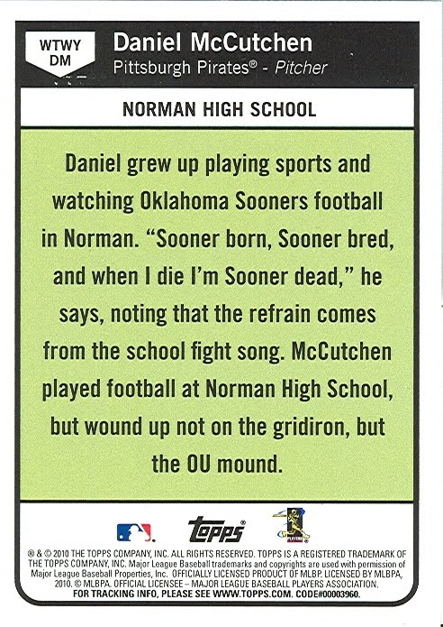
Going back to the backs.


I didn't realize how blue all the backs were. I mean to say that I realized that their were no variations in the backs, but I didn't realize how the two shades of blue really make the card backs kind of bland.

The backs do have a pretty nice layout though.


And of course they have the cool cartoons with a little home plate looking emblem containing the card number. Gotta love cartoons on the card backs.

Alright! That's it for now for my trip down 1980 Topps memory lane. I'm still not quite sure how many more cards I need, but it's roughly half of the set. I'm pretty excited to try and finish my favorite baseball card set. In the next few days I'm going to stick them in the binder so I can look at them easier. I don't want to have them cluttered all over my coffee table.

Thanks for reading.

Sunday, April 11, 2010

Vintage Saturday revisited

It's always good when I get to spend a Saturday at the flea market or at the card shop. My goals are pretty much the same: I'm not really expecting to find anything I actually "need", like for one of the sets I'm chasing or from a particular player.

What I'm basically looking for is something cool that I've seen on other blogs, something old that I don't already have or hopefully I'll run across something that I've never seen before.

This Saturday I feel like I've done all three, plus a little more. And it only cost me less than 3 dollars. Pretty cool. I don't mind spending more, but honestly there wasn't a lot to be had at the flea market yesterday so I think spending 3 dollars was about the limit.

I stopped by two tables. The first one had the obligatory zip lock bags taped up with random "packs" of cards. I picked up one of these only because the card on the front was one that I'm sure I've seen on another blog. I don't remember the blog right now, but I do remember commenting something when I saw it. Probably something stupid, but anyway here's the card:


A 1990 Topps of Walt Weiss. According to the back Walt is from Tuxedo,NY and is a big Bruce Springsteen fan who sometimes works as a guest disc jockey. I wonder if he used any baseball terminology as is DJ name?


Most of the rest of the pack was pretty boring, but there was another card that caught my eye:


Another 1990 Topps. It's got a lot of cool stuff going on in this card; it's a horizontal action shot of Eddie pitching into some shadowy, blurry figures. The ball looks like it's in orbit around the ump and batters heads.

Next up the guy had pages of cards to be bought for a dollar a piece. Near the end of the stack was the only promising page. I immediately noticed the two 75 cards and a Psychedelic Tombstone card and that's all I needed to see.


Sort of a Joy of a Completed Page, but not really since it was already completed for me. It won't be for long though. The cards will be broken up into little groups. I'm toying with the idea of trying to collect the entire 1973 and 1980 Topps sets. The bottom three cards will be my first 73's to start me on my way.


I spent probably 2 plus hours "playing" with these nine cards. I picked up the cards. Looked at them in the car. Ate lunch and then after mowing and a nap I picked them back up and sat out on my back porch checking them out again.

I'm pretty amazed at the photos in these cards. At first the photography doesn't seem that great, but on closer inspection they're actually pretty cool.

The Rivers card is really sharp and has nice colors.


Guerrero looks a little bit like actor Richard Edson. The signs in the background of these old cards are cool. This one looks like it says "Buck ..string CO.".


Not only are the fronts cool, but I get a lot out of the backs too.


I think this is one of the main appeals of these cards and the current Heritage cards. I really like the cartoons and the write ups more than stat lines. I'm not much of a stat guy, but I should be.


This is my first 72 card and the Psychedelic Tombstone card lives up to the hype. It has the saturated colors, skewed horizon line, huge catchers mitt you can put your head in and of course he's wearing some sort of women's shoes. To top it all off he's got a pretty cool name too. I'm pretty sure I've also seen this card on another blog, I just can't remember where.


I really thought the backs would be as colorful and psychedelic as the fronts, but that's not the case. I think the 1970 cards are more colorful. Their are little rounded tombstonesque corners near the card number and the cartoon.


I think this is my only Alomar card. As with all of these cards I didn't even notice the creases or miscuts or pencil marks. This card features two creases and a couple of dinged corners. Still a cool card though.


To me that only adds to the character of these old cards.


I didn't know Jim Perry, I've only heard of Gaylord. It has a nice write up on the back.


The World Series highlight card is pretty cool. I realized it was miscut only after getting into the car. the part that I can see is a name that looks like Morrlee. Or maybe Murrlll. Haha. Checking out the checklist online hasn't helped me to figure out who it is.


The card itself is cool. I got an appreciation from horizontal and night cards from Night Owl and this card is pretty cool. It looks like the Mets won this game. The series was finally won in 7 games by the defending champion Oakland A's. I would have liked to see this series. From the wikipedia article it seems like it would have been an entertaining series to watch.


Getting back to the page I can't think of anything interesting or witty to say about this card.

Actually I haven't said anything witty or interesting yet about any of these cards. I need to get cracking on that. I do like the clouds though.


I can see another player in a Houston hat in the background of the Rader card. I think I can almost make out the lettering on the sign. I think it says "Matthew's Garden Supply". That may not be right. I'm pretty sure on the Matthew's and the Supply part though.


I can tell from the LaGrow card that the photographer used some fill lighting on this card. Or possibly a reflector to bounce some light back into his face. I think that's right. You can see the bright sunlight hitting his left eye and the shadow from his hat. The reason why I think some other lighting or a reflector was used is because his face is well exposed and also because of the hard shadow on his left nostril that should be lit from the sunlight.


Okay enough with all the Photo CSI stuff. Let's get on with the cards from the category of Stuff I Didn't Know Existed.

I only found 7 of these cards. They're all black and white and were produced in 1988. These have cool write ups on the back and come from the Charles Martin Conlon Collection.


Starting with the top card: David Dale Alexander, Charles Walter Dressen, Carl William Mays, Robert Moses Grove, Jay Hanna Dean (dizzy dean), Harold Homer Chase and Frederick Charles Merkle.

Some of these photos look a little like dust bowl era photos from Dorothea Lange.

The name sounded familiar so I looked him up. Here is a bio about him at Sporting News.

Here is a cool Gallery of some of his more famous photos.


Here's a back for posterity sakes.


Next up is a guy in an OU uniform. It's Adrian Cooper.


I couldn't quite place the name at first. I knew I had read about him recently which isn't a good sign. Apparently he ran afoul of the law with some sort of money laundering. Nice. I find one OU player and he's a convicted felon. Cool. I guess it'll still go into the OU binder. If I refuse to put athletes that ran afoul of the law in my football binder it'd be pretty empty.

All in all a pretty successful day for cool vintage cards.


Alright that's it for another random vintage roundup. Thanks for reading.

Sunday, April 4, 2010

Daniel McCutchen

I received an email from a reader(reader? Who reads this crap?) named Robert who doesn't have his own blog yet. Or at least he didn't when he first contacted me. I'm so far behind on my blog posts he might have gone ahead and started a blog. If he does, and he's reading this I hope he starts one so I can check it out. Like me, he's a Mets fan.

Anyway, he offered up a lot of Oklahoma guys that I listed over on my other blog, which isn't much of a blog. It's just a place for me to write down which random cards that I'm interested in.

I don't want to show off every card that he sent right now. I just want to show off one of a current player that I'm excited about.

It's a McCutchen for the Pittsburgh Pirates. Not Andrew McCutchen, but Daniel McCutchen. You might remember him only from the When They Were Young insert set in this years Topps Baseball.


I really don't like these cards that much, but I'm familiar with the player so that's why I'm in to this particular card.

The back explains why I have interest in this guy.


Yeah, he's a Sooner just like me.

His base card list him as from McKinney, Texas but I know that he went to high school here in Norman and he was a pitcher at OU.

The reason why I know this is because my first "real" photojournalist job was when I made my ill conceived return to college a few years back to work on my masters in journalism. This was about 4 years ago and I had already earned a Bachelors degree in Art. I didn't like where I was financially and thought that by going to school again I could improve my life.

Honestly it wasn't a good idea. I never got my masters. I did learn a lot. Not to sound too cocky, but one of the things that I learned was that I really wasn't that bad at videography or photography and I should just keep doing what I was doing. I kind of wished I would have went at it a little differently, but I don't regret going back to college. It was fun and I really did learn some things. I just didn't get that degree.

My main reason at the time was to try broadcast journalism and get a job for a TV station or something. While at OU I was drawn more to print journalism. I've always held newspapers in high esteem so I gravitated towards the school newspaper. Anytime I find myself with free time or when I go on vacation I always seek out a local paper. No matter the size of the paper I'm always interested in the place that I'm visiting and I feel a little odd if I don't check out the local news.

It was a little bit of an adjustment going back to school after an almost 8 year absence. I didn't have a lot in common with the kids, but I did fit in more than I thought I would. Apparently I don't look as old as I think I do and they didn't realize at first that I was as old as I was so that seemed to help to fit in a little bit.

I think I applied on a Wednesday and by Friday I was covering OU vs TCU in a College World Series Regional held in Norman. They basically handed me a camera and asked me to "get something usable."

So, off I went with no real idea of how to use this equipment. I just wanted to get some cool action shots like in the newspapers or magazines.

For the record the camera was a top of the line DSLR. It was the Canon MarkIIn. Much, much different than my dad's digital Rebel and way different than all my old 35mm SLR's.

It was a bit of a learning curve and I'm not really that happy with most of the photos that I took that night, but I still managed to get something "usable".

So on that note, I want to show off some photos that sort of relate to the Pirates rookie.

This is a wide shot of our ballpark. It's named after L. Dale Mitchel. He played left field for the Indians and Brooklyn Dodgers in the 1940's and 1950's.


I was pretty excited so I showed up a little early.

The grounds crew were hanging out.


Here are the guys during pregame.


A pregame prayer from McCutchen.


Here is an attempted pickoff.


He tried this all night. I don't think he ever picked a guy off in the game.

But I like the shot. I would have liked it a lot more if I knew how to use the equipment better. I would have liked to have a more shallow depth of field for this shot so that the people in the background were a little bit more out of focus. I also would have liked the first baseman to be a little more sharper and in focus. But, you live you learn.


This is a nice shot from later in the night.


Still praying.
I don't really remember much about the game itself only that it was a rough night for the Sooners as they lost 6-5 with 3 runs scored by TCU in the 9th inning.

Now that I've caught up to him. I'm going to try and keep up with his exploits this year and see how he does. I'm hoping that Daniel has a good year with the Pirates.

Thanks for the card Robert! I'll definitely do more posts on all the cool cards you sent me.

Thanks for reading.