
Wednesday, November 17, 2010
Contest at The Vintage Sportscards Blog
The Vintage Sportscards blog is having a cool contest of vintage cards. (What else would a blog about vintage cards be offering up!!) Head over there and see if you can win a cool vintage card. Chris is also the guy that has the cool 1973 Topps photography blog. Check out either of them if you are into vintage.
Respect your elders
I haven't done a vintage Saturday type post for a while so I thought I'd knock one out. I know that technically it's not Saturday, but I've been busy with football season and life stuff. The life stuff is good stuff, not bad stuff. But still, life has a tendency to get in the way though.
This particular post is sponsored by the Topps Million Card Giveaway. I finally got around to having some of my cards delivered. I'm really surprised by how quickly they got here! I think it was late Wednesday night when I ordered them and by Saturday I had them in my hands. I know that there was a least one blogger complaining about Topps not having the cards in stock that they requested. Thankfully I didn't have to go through that.

First up is this card of Skip Pitlock. This was one of the cards that I showed off when the Giveaway was still fresh on people's minds, but now that I have the card in hand I wanted to scan it and show it off again. He looks just as dorky in "person" as he does online, but the card itself is in pretty decent shape. A little miscut, but not much chipping.
I noticed that the 1971 cards are a lot darker compared to other vintage cards. The 1970 cards have those gray borders and they don't call the '72 set the psychedelic tombstone set for nothing.

Maybe it's because I "pulled" this 2007 card out of the bubble mailer right after the Pitlock card, but I think the 1971 and 2007 cards have some similarities. Obviously the black borders, but...

..also on the two cards you can see a box for the players head, albeit much smaller on the '07 than the window on the 1971 card. There is also an absence of a cartoon on both cards. The 1970 and 2006 cards both had cartoons. Hmm. That might be the impetus for another post, but for now I'm just saying their are a few similarities. I guess you can make a case for a lot of the card sets having some similar traits.
Yes, I had a 2007 card set to me. Don't ask me why, possibly I just had a brain freeze. I had about 6 cards that I was on the fence about having sent home, and three of them made it to my house. I probably shouldn't have done that, but oh well. I just can't stand the idea of something that I "own" sitting in some warehouse. I think I still have two cards sitting in the virtual warehouse gathering dust.
 This card was a no brainer to have delivered. It's a 1966 Ray Herbert card. Looking at it in person I originally thought it was from 1970.
 Side by side you can see the similarities.

The backs of the two sets are similar too. Again, I guess with a little imagination a lot of the card sets could be "similar" in most respects. cartoons, stat lines and player portraits, but these '66 and '70 seem pretty close in a lot of ways. ( for full disclosure I got the Alomar card at a flea market, not the MCG site)
The most colorful and oldest card that I obtained from the Giveaway was this cool Murray card.

It's got all the makings of a vintage card:
1. Miscut? Check!
2. Colorful background Check
3. Confused expression on subject's face Check!
4. Retired franchise Check!
Great card!
 The funny thing is that I didn't notice that it was larger than the other cards. This is my first time dealing with a card this old and I forgot that they were of a different size than modern cards. Hopefully this side by side comparison shows off the dimensions better. I didn't realize that their were toploaders that size too. I guess you learn all sorts of stuff from vintage cards.

The cartoon is pretty cool. For some reason I always have an affinity for players who have played in Oklahoma at some point in their career.
This is by far my oldest card in my collection. Pretty nice if you ask me. Thanks for reading and if for any reason somebody else has used the title "respect your elders" in regards to a vintage style post I'm sorry in advance. I didn't try to plagiarize anybody I just thought it was a clever title.
This particular post is sponsored by the Topps Million Card Giveaway. I finally got around to having some of my cards delivered. I'm really surprised by how quickly they got here! I think it was late Wednesday night when I ordered them and by Saturday I had them in my hands. I know that there was a least one blogger complaining about Topps not having the cards in stock that they requested. Thankfully I didn't have to go through that.

First up is this card of Skip Pitlock. This was one of the cards that I showed off when the Giveaway was still fresh on people's minds, but now that I have the card in hand I wanted to scan it and show it off again. He looks just as dorky in "person" as he does online, but the card itself is in pretty decent shape. A little miscut, but not much chipping.
I noticed that the 1971 cards are a lot darker compared to other vintage cards. The 1970 cards have those gray borders and they don't call the '72 set the psychedelic tombstone set for nothing.

Maybe it's because I "pulled" this 2007 card out of the bubble mailer right after the Pitlock card, but I think the 1971 and 2007 cards have some similarities. Obviously the black borders, but...

..also on the two cards you can see a box for the players head, albeit much smaller on the '07 than the window on the 1971 card. There is also an absence of a cartoon on both cards. The 1970 and 2006 cards both had cartoons. Hmm. That might be the impetus for another post, but for now I'm just saying their are a few similarities. I guess you can make a case for a lot of the card sets having some similar traits.
Yes, I had a 2007 card set to me. Don't ask me why, possibly I just had a brain freeze. I had about 6 cards that I was on the fence about having sent home, and three of them made it to my house. I probably shouldn't have done that, but oh well. I just can't stand the idea of something that I "own" sitting in some warehouse. I think I still have two cards sitting in the virtual warehouse gathering dust.
 This card was a no brainer to have delivered. It's a 1966 Ray Herbert card. Looking at it in person I originally thought it was from 1970.
 Side by side you can see the similarities.
The backs of the two sets are similar too. Again, I guess with a little imagination a lot of the card sets could be "similar" in most respects. cartoons, stat lines and player portraits, but these '66 and '70 seem pretty close in a lot of ways. ( for full disclosure I got the Alomar card at a flea market, not the MCG site)
The most colorful and oldest card that I obtained from the Giveaway was this cool Murray card.

It's got all the makings of a vintage card:
1. Miscut? Check!
2. Colorful background Check
3. Confused expression on subject's face Check!
4. Retired franchise Check!
Great card!
 The funny thing is that I didn't notice that it was larger than the other cards. This is my first time dealing with a card this old and I forgot that they were of a different size than modern cards. Hopefully this side by side comparison shows off the dimensions better. I didn't realize that their were toploaders that size too. I guess you learn all sorts of stuff from vintage cards.
The cartoon is pretty cool. For some reason I always have an affinity for players who have played in Oklahoma at some point in their career.
This is by far my oldest card in my collection. Pretty nice if you ask me. Thanks for reading and if for any reason somebody else has used the title "respect your elders" in regards to a vintage style post I'm sorry in advance. I didn't try to plagiarize anybody I just thought it was a clever title.
Saturday, November 6, 2010
Trade with Reds and More
I've been a procrastinating blogger these days. I want to blog. I need to blog but I just can't get up the energy to post up anything . I know the world is clamoring for another one of my lengthy trade posts so here goes.
I personally love reading other peoples' trade posts for the simple fact that I want to vicariously live through their card acquisitions. I'm hoping that people will want to live vicariously through my card acquisitions too and see what cool stuff came in the mail.
This selection of cards comes all the way from Bixby, Oklahoma which should easily be the closest blogger to me in proximity.
Cam of Reds and More was advertising a team set giveaway. Like any greedy blogger I jumped at the chance to pick up some Mets cards. I really didn't expect the amount of cards that would be in the box though. The scope of the years and different sets is staggering.
Before Cam I only had a small Mets team set binder. After seeing the box of cards he sent over I went out and got a bigger binder and a lot more pages. It's been easily a month and I still haven't gotten a chance to really go over the entire box and organize everything like I want.
The cards range from vintage to retro to shiny and everything in between. The vintage took me by surprise.
 You can probably tell from the photos how many cards he sent over. Actually this is only a small portion of the cards in the box.
Vintage...

Shiny..

...and retro...

Let's start with the vintage.
 I have only two '75 Mets cards. Seeing this assortment of vintage cards reminds me that I need to get to the card store and see what kind of cool old cards I can find. This Ted Martinez card was one of 9 cards that Cam sent over. I have this goal to complete as many team sets or complete sets and these cards gives me a good start on the Mets team set.
This is a great indication of the other '75 cards with the cool expression and even cooler facial hair!!
 I have about 10 or so cards that I'd like to have from 1974 detailing the world series games between the A's and Mets. Seeing this team card makes me want to try for the whole set.
Let's work our way down to the retro.

I haven't had a chance to see any Cracker Jack cards in person, so this is my first exposure to them. Pretty nice. I think they're nicer looking in person than online. This would be a neat set to try and complete or at least search around for some singles.

This Reyes mini is cool. I have the base card and the mini goes nice with that one. I think I have two of the minis from this set now. I still enjoy seeing the dirt on his jersey in this card.
Lastly some shiny:

Prior to this I didn't have nearly enough shiny in my collection. That's a pretty common theme amongst bloggers though. Everybody could use more chrome. I have a random chrome card or two from this year, but now I'm pretty close to finishing off the 2009 chrome Mets.
 A nice selection of Walmart black Mets to go with a couple of others already in the binder.

a bunch of really nice 2008 chrome cards to go with a huge stack of non-chrome base cards from '08. Here's an example of one each of my favorite pitcher Johan Santana.
These two shiny 2007 cards are the first chrome cards from 2007 that I've laid my eyes on.


Cool actions shots make these cards better in my opinion.

All bloggers probably are like me in that we find little things that appeal to us that makes us like a card more than normal. One big reason why I like this card is that it's a "Farmhand Signature" card, but the dude's name is Vineyard. Get it? Oh well. It's sort of a reach, but it amuses me and that's all that matters.
Unfortunately it looks he's retired from baseball. Still it will be a good addition to my unusual names collection.
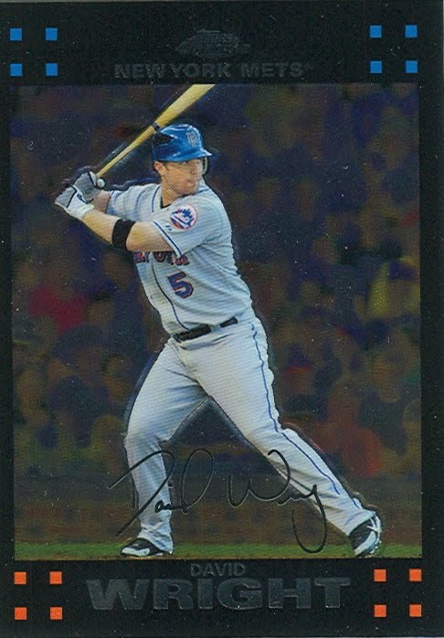
Another prospect who has done well for the Mets is this guy:

A Just Minors card of David Wright has a slight Heritage feel. The minor league uniform complete with dorky batting gloves set against a minor league stadium background with billboards and pine trees seems more Heritage-y than Heritage. Maybe Topps could pick some old fashion backgrounds to shoot their subjects against.
I still haven't gotten to the Packers cards that he sent over that were much appreciated. Maybe I'll do a part two post to show off the rest of the cards.
I loved the cards Cam! Thanks very much. I'm working on another package to send your way.
I personally love reading other peoples' trade posts for the simple fact that I want to vicariously live through their card acquisitions. I'm hoping that people will want to live vicariously through my card acquisitions too and see what cool stuff came in the mail.
This selection of cards comes all the way from Bixby, Oklahoma which should easily be the closest blogger to me in proximity.
Cam of Reds and More was advertising a team set giveaway. Like any greedy blogger I jumped at the chance to pick up some Mets cards. I really didn't expect the amount of cards that would be in the box though. The scope of the years and different sets is staggering.
Before Cam I only had a small Mets team set binder. After seeing the box of cards he sent over I went out and got a bigger binder and a lot more pages. It's been easily a month and I still haven't gotten a chance to really go over the entire box and organize everything like I want.
The cards range from vintage to retro to shiny and everything in between. The vintage took me by surprise.
 You can probably tell from the photos how many cards he sent over. Actually this is only a small portion of the cards in the box.
Vintage...

Shiny..

...and retro...

Let's start with the vintage.
 I have only two '75 Mets cards. Seeing this assortment of vintage cards reminds me that I need to get to the card store and see what kind of cool old cards I can find. This Ted Martinez card was one of 9 cards that Cam sent over. I have this goal to complete as many team sets or complete sets and these cards gives me a good start on the Mets team set.
This is a great indication of the other '75 cards with the cool expression and even cooler facial hair!!
 I have about 10 or so cards that I'd like to have from 1974 detailing the world series games between the A's and Mets. Seeing this team card makes me want to try for the whole set.
Let's work our way down to the retro.

I haven't had a chance to see any Cracker Jack cards in person, so this is my first exposure to them. Pretty nice. I think they're nicer looking in person than online. This would be a neat set to try and complete or at least search around for some singles.

This Reyes mini is cool. I have the base card and the mini goes nice with that one. I think I have two of the minis from this set now. I still enjoy seeing the dirt on his jersey in this card.
Lastly some shiny:

Prior to this I didn't have nearly enough shiny in my collection. That's a pretty common theme amongst bloggers though. Everybody could use more chrome. I have a random chrome card or two from this year, but now I'm pretty close to finishing off the 2009 chrome Mets.
 A nice selection of Walmart black Mets to go with a couple of others already in the binder.
a bunch of really nice 2008 chrome cards to go with a huge stack of non-chrome base cards from '08. Here's an example of one each of my favorite pitcher Johan Santana.
These two shiny 2007 cards are the first chrome cards from 2007 that I've laid my eyes on.

Cool actions shots make these cards better in my opinion.
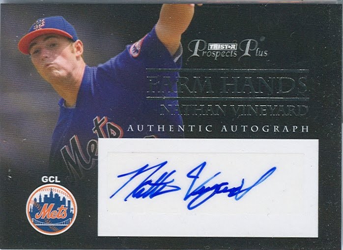
All bloggers probably are like me in that we find little things that appeal to us that makes us like a card more than normal. One big reason why I like this card is that it's a "Farmhand Signature" card, but the dude's name is Vineyard. Get it? Oh well. It's sort of a reach, but it amuses me and that's all that matters.
Unfortunately it looks he's retired from baseball. Still it will be a good addition to my unusual names collection.
Another prospect who has done well for the Mets is this guy:

A Just Minors card of David Wright has a slight Heritage feel. The minor league uniform complete with dorky batting gloves set against a minor league stadium background with billboards and pine trees seems more Heritage-y than Heritage. Maybe Topps could pick some old fashion backgrounds to shoot their subjects against.
I still haven't gotten to the Packers cards that he sent over that were much appreciated. Maybe I'll do a part two post to show off the rest of the cards.
I loved the cards Cam! Thanks very much. I'm working on another package to send your way.
Subscribe to:
Posts (Atom)


